![]()
One of the most brilliant logos of all time is, apparently, an orphan, nowhere to be found on the Internet via image search. It appeared in the 1970s, where I caught sight of it in the Wall St Journal. The foreground-background illusion is strong: a thick block letter "M", or divergent tangram-like arrows in a diamond with tails that almost fit together. The image here is my attempt to reproduce it from memory, and doesn't get the proportions quite right. The symbol represented MAPCO Coal Inc.
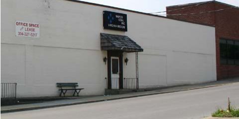
MAPCO changed its name to Alliance Coal in 1996. A company building is for sale or lease in West Virginia. If you look closely above the front door you can see the old logo.
(cf. LogoVision (2003-05-03), AmigaCheck (2004-05-19), Kubota Logo Mystery (2008-02-15), ...) - ^z - 2009-07-05